# load and install package
knitr::opts_chunk$set(warning = FALSE, message = FALSE)
if (!require("pacman")) install.packages("pacman")
pacman::p_load(
  tidyverse,
  probstats4econ,
  kableExtra,
  RColorBrewer,
  curl,
usethis)Lab 03: Descriptive Statistics and Visualization
Due date
This lab is due on Monday, September 29 at 11:59pm. To be considered on time, the following must be done by the due date:
- Final
.qmdand.pdffiles pushed to your GitHub repo - Final
.pdffile submitted on Gradescope
Introduction
The main goal is to practice version control using Github. Most of these labs is adopted from happygitwithr.com materials.
Learning goals
By the end of the lab, you will:
Create GitHub repository from an R project
Collaborate with teammates in a project via GitHub
Produce descriptive statistics
Produce data visualizations
Setup Packages
Exercise 1: Creating your Own GitHub Repository
Make sure you have already created your Labs R Project folder. The name of your folder should be ECON2250_Labs_LastName_FirstName. One way to check if you’re doing it correctly is if a files with .Rproj extension exists in your Files window in RStudio. If this is not yet done, you need to create this (follow steps explained in Lab 1).
Now, we are going to our own GitHub repository from this existing R projects. Follow these steps:
Ask one of your classmates to be your partner. These labs session is a group work.
Make sure you install all the packages listed above.
Install git on you computer. And check if it shows up in Rstudio, if not go to Tools \(\rightarrow\) Version Control and select Git.
Create your GitHub Token:
usethis::create_github_token()- Set your GitHub credentials
gitcreds::gitcreds_set()- Create your GitHub repository
usethis::use_github()Exercise 2: Collaborating with GitHub
Now, we are going to learn how to collaborate using GitHub. Follow these steps:
Go to your GitHub repo on GitHub.com, go to Settings \(\rightarrow\) Collaborators \(\rightarrow\) Add people, then look for your teammates GitHub profile. Each teammates must do this, so you both will be collaborators on each Labs repository.
Now as a collaborators you can collaborate with your teammates repository, by cloning their repository. Go to their repository and copy the HTTPS url to clone their repository, this will looks like this:
https://github.com/theirGitHubUserName/ECON2250_Labs_LastName_FirstName.git.Then in RStudio, go to File \(\rightarrow\) New Project \(\rightarrow\) Version Control \(\rightarrow\) Git and paste the Repository URL, and place it in a different folder than your original Rproject. Open the new R project in new window so that you keep your own project open.
Now we can try several command in the Terminal:
git status,git commit,git push,git fetch, andgit push. See here if you want to know more than this. Now, let’s try to type something below in your collaborators repository, then commmit, and push it. Check your repo as well.
Type line below here:
To complete these exercise, you have to have at least one contributions from your teammates in your repository.
Exercise 3: Creating Descriptive Statistics
Single Variable
A subsample of the 2019 Current Population Survey (CPS)
cps%>%glimpse()Rows: 4,013
Columns: 17
$ statefips <fct> CA, AK, MT, NY, SC, TN, AL, CO, MD, TX, TX, MA, AZ, IL, WY…
$ age <int> 50, 34, 50, 30, 40, 35, 56, 42, 55, 58, 39, 59, 39, 58, 34…
$ hrslastwk <int> 40, 40, NA, 44, NA, 30, 40, 25, 40, 46, 41, 44, 30, 8, 60,…
$ unempwks <int> NA, NA, NA, NA, NA, NA, NA, NA, NA, NA, NA, NA, NA, NA, NA…
$ wagehr <dbl> 12.00, NA, NA, NA, NA, NA, 25.00, 8.00, NA, NA, 22.78, 31.…
$ earnwk <dbl> 576.92, 3048.59, NA, 2500.00, NA, 300.00, 1000.00, 1000.00…
$ ownchild <int> 0, 1, 4, 0, 0, 0, 0, 0, 0, 0, 1, 0, 0, 0, 0, 2, 2, 2, 0, 0…
$ educ <dbl> 14.0, 18.0, 16.0, 18.0, 12.0, 12.0, 12.0, 7.5, 12.0, 13.0,…
$ gender <fct> Male, Female, Male, Female, Female, Male, Male, Female, Fe…
$ metro <fct> Metro, Metro, Metro, Metro, Metro, Metro, Metro, Metro, Me…
$ race <fct> Black, White, White, White, Black, White, White, Black, Ot…
$ hispanic <fct> Non-hispanic, Non-hispanic, Hispanic, Non-hispanic, Non-hi…
$ marstatus <fct> Never married, Married, Married, Never married, Never marr…
$ lfstatus <fct> Employed, Employed, Not in LF, Employed, Not in LF, Employ…
$ ottipcomm <fct> No, No, NA, No, NA, No, No, No, No, No, No, No, No, No, No…
$ hourly <fct> Hourly, Non-hourly, NA, Non-hourly, NA, Non-hourly, Hourly…
$ unionstatus <fct> Non-union, Non-union, NA, Non-union, NA, Non-union, Non-un…Categorical Data: Example
A subsample of the 2019 Current Population Survey (CPS)
table(cps$lfstatus)
  Employed  Not in LF Unemployed
2809 1098 106 table(cps$lfstatus)/nrow(cps)
  Employed  Not in LF Unemployed
0.69997508 0.27361077 0.02641415
Table of sample count and sample proportion of 2019 CPS by labor force status
count_sum<-cps|>group_by(lfstatus)|>
  summarize('Sample Count'=n(),
            'Sample Proportion (%)'=round(100*n()/nrow(cps),2))|>
  add_row(lfstatus="Total", 'Sample Count'=nrow(cps), 'Sample Proportion (%)'=100)|>
  rename('Labor Force Status'=lfstatus)
kbl(count_sum, booktabs = T) %>%
kable_styling(position = "center")| Labor Force Status | Sample Count | Sample Proportion (%) |
|---|---|---|
| Employed | 2809 | 70.00 |
| Not in LF | 1098 | 27.36 |
| Unemployed | 106 | 2.64 |
| Total | 4013 | 100.00 |
Bar charts of sample count and sample proportion of 2019 CPS by labor-force status
par(mfrow = c(1,2))
# barchartwithsamplecounts
barplot(table(cps$lfstatus), ylim=c(0,3000), main="Bar chart (counts) of
labor-force status")
# barchartwithsampleproportions
barplot(table(cps$lfstatus)/nrow(cps), ylim=c(0,0.8), main="Bar chart (proportions)
of labor-force status")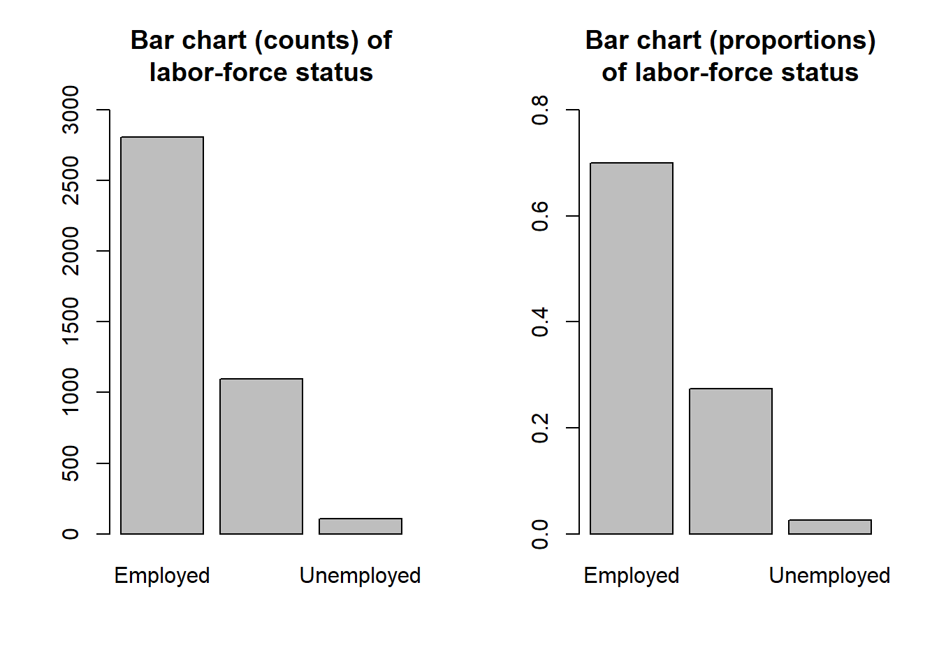
Numerical Data: Example
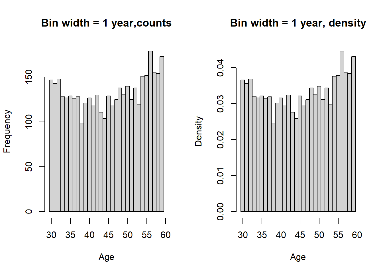
Histogram of 2019 CPS age distribution
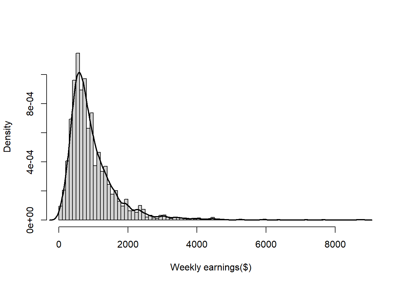
Histogram and density plot of 2019 CPS weekly earnings distribution of employed individuals
Sample quantiles: Example
Sample quantiles of 2019 CPS weekly earnings quantiles
# Histogram with density
hist(cpsemployed$earnwk, breaks=92, freq=FALSE,
     main="", xlab="Weekly earnings($)")
lines(density(cpsemployed$earnwk), lwd=2, lty=1)

# Quantiles
qs <- quantile(cpsemployed$earnwk, probs=c(0.05, 0.10, 0.25,
                                           0.50, 0.75, 0.90, 0.95),
               na.rm=TRUE)

# Brewer palette with 7 distinct colors
cols <- brewer.pal(n=7, name="Set1")

# Add vertical lines with colors
for (i in seq_along(qs)) {
  abline(v=qs[i], col=cols[i], lwd=2, lty=2)
}

# Legend
legend("topright", legend=names(qs),
       col=cols, lwd=2, lty=1, cex=0.8,
       title="Quantiles")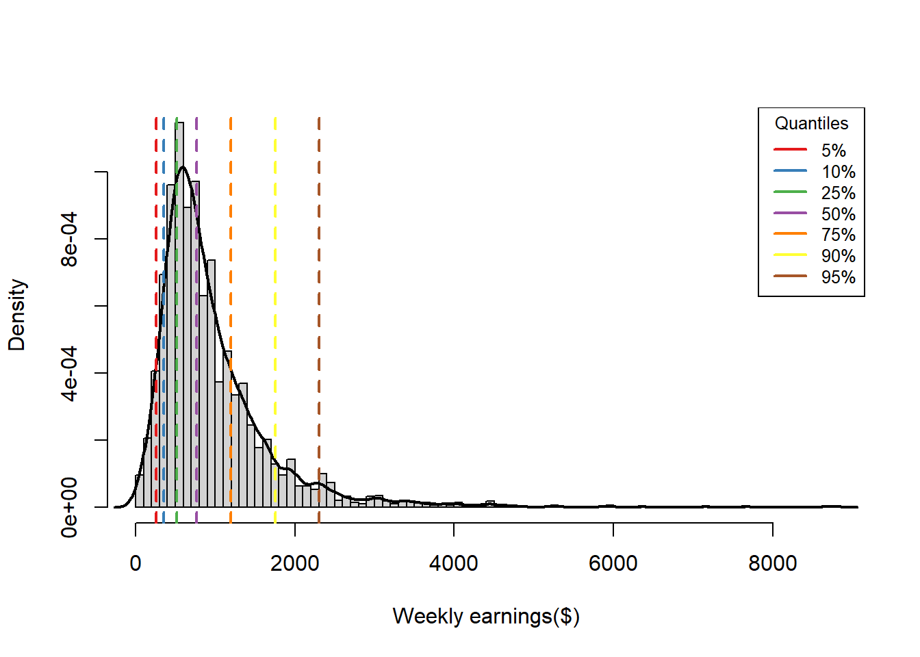
Boxplot: Example
2019 CPS weekly earnings
par(mfrow = c(1,2), pin=c(2,3))
# box plot with whiskers and outliers (the default in R)
boxplot(cpsemployed$earnwk, ylab="Weekly earnings",
main="Box plot (whiskers and outliers)")
# box plot with whiskers at min and max values
boxplot(cpsemployed$earnwk, range=0,ylab="Weekly earnings",
main="Box plot (whiskers at min/max)")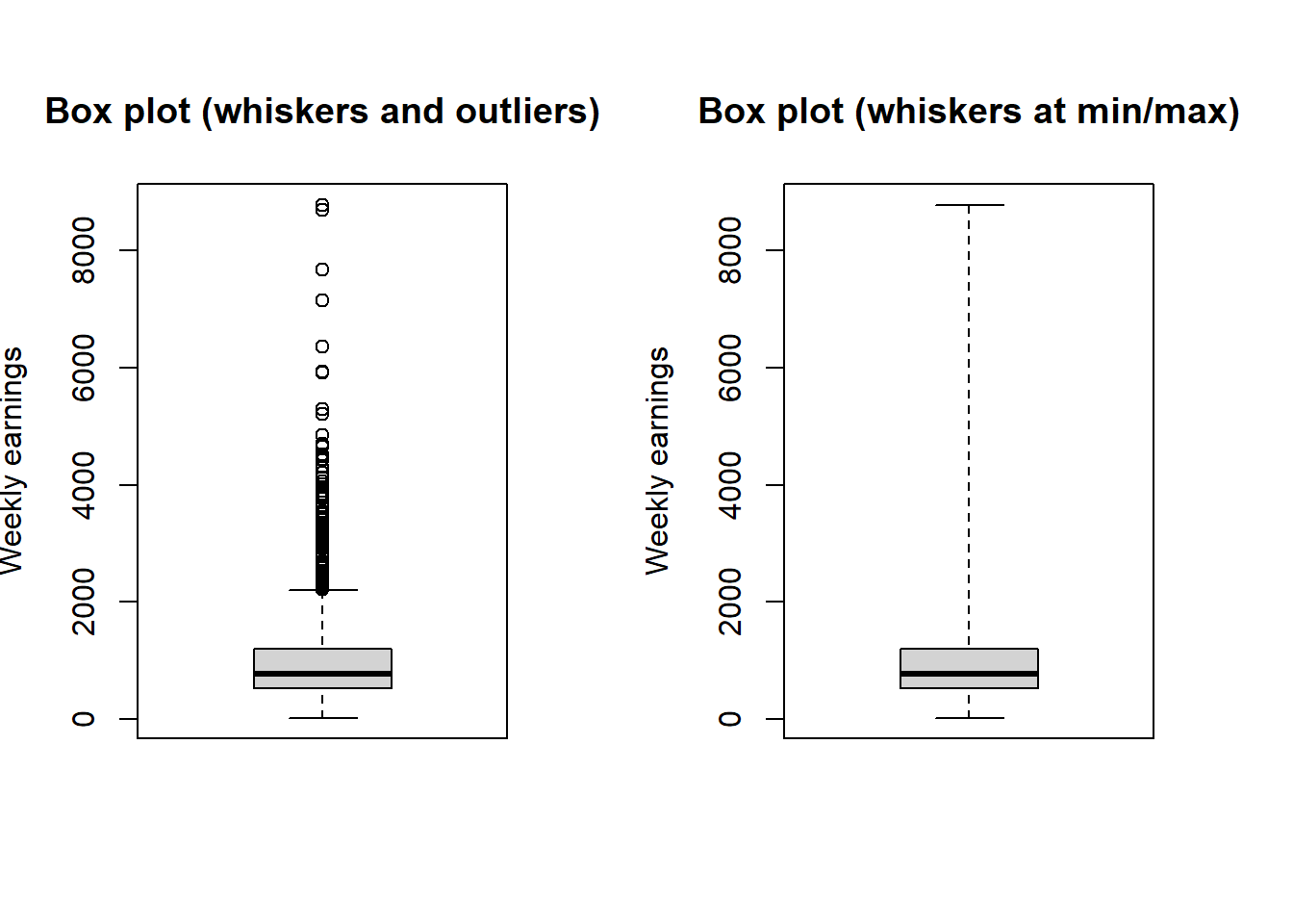
Descriptive statistics: Example
2019 CPS Union vs Non-union worker’s wage
union_summary<-cpsemployed%>%
  group_by(unionstatus)%>%
  summarise(
    n = n(),
    mean = round(mean(earnwk, na.rm = TRUE),2),
    MAD = round(mean(abs(earnwk - mean(earnwk, na.rm = TRUE)), na.rm = TRUE),2),
    variance = round(var(earnwk, na.rm = TRUE),2),   # uses n-1 in denominator
    sd = round(sd(earnwk, na.rm = TRUE),2)
  )
union_summary
# A tibble: 2 × 6
unionstatus n mean MAD variance sd
<fct> <int> <dbl> <dbl> <dbl> <dbl>
1 Non-union 2533 946. 489. 562120. 750.
2 Union 276 1198. 532. 518379. 720.kbl(union_summary, format="latex", booktabs = T, escape=F,
align=c("l","c","c","c","c","c"),
caption = "Union vs non-union worker's wage (CPS, 2019)",
col.names = c("Union Status", "Sample Size ($n$)", "Mean ($\\overline{x}$)",
"MAD", "Variance ($s_x^2$)", "Std. Dev. ($s_x$)")) %>%
kable_styling(position = "center")%>%
footnote(general = "Here is a general notes for this table.")2019 CPS Male vs female worker’s wage
gender_summary<-cpsemployed%>%
  group_by(gender)%>%
  summarise(
     n = n(),
    mean = round(mean(earnwk, na.rm = TRUE),2),
    MAD = round(mean(abs(earnwk - mean(earnwk, na.rm = TRUE)), na.rm = TRUE),2),
    variance = round(var(earnwk, na.rm = TRUE),2),   # uses n-1 in denominator
    sd = round(sd(earnwk, na.rm = TRUE),2)
  )
gender_summary
# A tibble: 2 × 6
gender n mean MAD variance sd
<fct> <int> <dbl> <dbl> <dbl> <dbl>
1 Female 1308 803. 415. 457066. 676.
2 Male 1501 1117. 530. 610218. 781.kbl(gender_summary,format="latex", booktabs = T, escape=F,
align=c("l","c","c","c","c","c"),
caption = "Male vs female worker's wage (CPS, 2019)",
col.names = c("Gender", "Sample Size ($n$)", "Mean ($\\overline{x}$)",
"MAD", "Variance ($s_x^2$)", "Std. Dev. ($s_x$)")) %>%
kable_styling(position = "center")Multiple variable
Joint sample counts or proportion: Example
Joint sample count for labor-force status and race
joint_count<-addmargins(table(cps$lfstatus, cps$race))
kbl(joint_count, booktabs = T) %>%
kable_styling(position = "center")| Black | Other | White | Sum | |
|---|---|---|---|---|
| Employed | 324 | 241 | 2244 | 2809 |
| Not in LF | 136 | 99 | 863 | 1098 |
| Unemployed | 16 | 9 | 81 | 106 |
| Sum | 476 | 349 | 3188 | 4013 |
Joint sample proportion for labor-force status and race
joint_proportion<-round(addmargins(table(cps$lfstatus, cps$race))/nrow(cps),3)
kbl(joint_proportion, booktabs = T) %>%
kable_styling(position = "center")| Black | Other | White | Sum | |
|---|---|---|---|---|
| Employed | 0.081 | 0.060 | 0.559 | 0.700 |
| Not in LF | 0.034 | 0.025 | 0.215 | 0.274 |
| Unemployed | 0.004 | 0.002 | 0.020 | 0.026 |
| Sum | 0.119 | 0.087 | 0.794 | 1.000 |
Sample proportions of labor-force status conditional on race
joint_proportion_race<-round(prop.table(table(cps$lfstatus, cps$race),margin=2),3)
kbl(joint_proportion_race, booktabs = T) %>%
kable_styling(position = "center")| Black | Other | White | |
|---|---|---|---|
| Employed | 0.681 | 0.691 | 0.704 |
| Not in LF | 0.286 | 0.284 | 0.271 |
| Unemployed | 0.034 | 0.026 | 0.025 |
Sample proportions of race conditional on labor-force status
joint_proportion_lfstatus<-round(prop.table(table(cps$lfstatus, cps$race),margin=1),3)
kbl(joint_proportion_lfstatus, booktabs = T) %>%
kable_styling(position = "center")| Black | Other | White | |
|---|---|---|---|
| Employed | 0.115 | 0.086 | 0.799 |
| Not in LF | 0.124 | 0.090 | 0.786 |
| Unemployed | 0.151 | 0.085 | 0.764 |
Bar charts: Example
Labor-force status proportions by race
# create sample count table for race and labor-force status variables
tbl_racelf <- table(cps$race, cps$lfstatus)
# barplot command --- categories on x-axis are based upon columns (lfstatus) of the table
barplot(prop.table(tbl_racelf, margin=1), ylim=c(0,0.8), col=c("gray30","gray50", "gray70"),
legend.text=rownames(tbl_racelf), beside=TRUE, main="")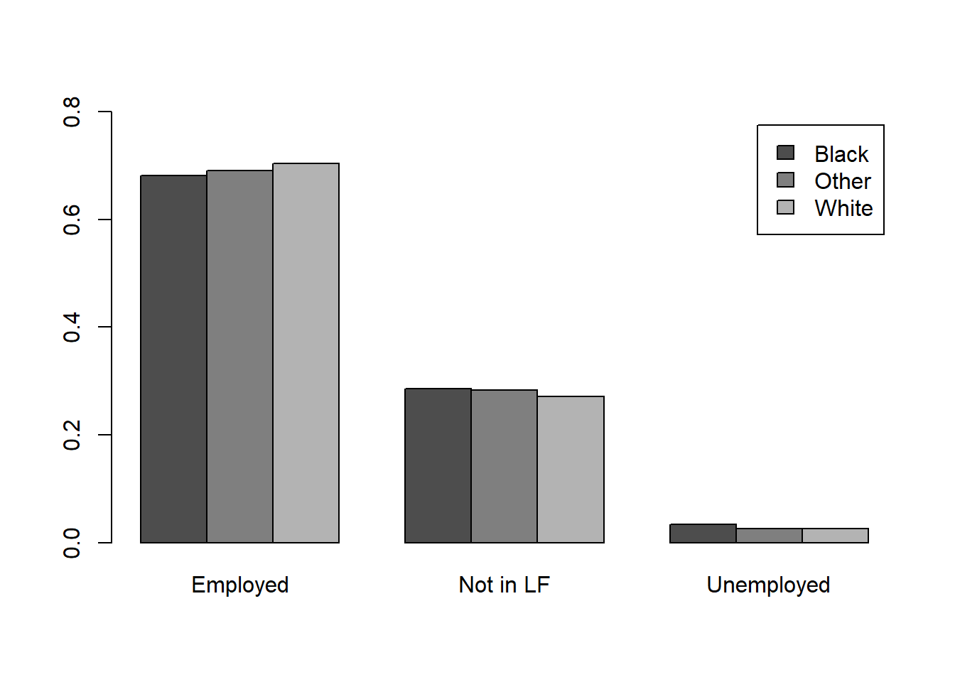
Race proportions by labor-force status* {.smaller auto-animate=“true”}
# create sample count table table for race and labor-force status variables
tbl_lfrace <- table(cps$lfstatus, cps$race)
# barplot command --- categories on x-axis are based upon columns (race) of the table
barplot(prop.table(tbl_lfrace, margin=1), ylim=c(0,0.8), col=c("gray30","gray50", "gray70"),
legend.text=rownames(tbl_lfrace), beside=TRUE,
args.legend = list(x="topleft",inset=0.01), main="")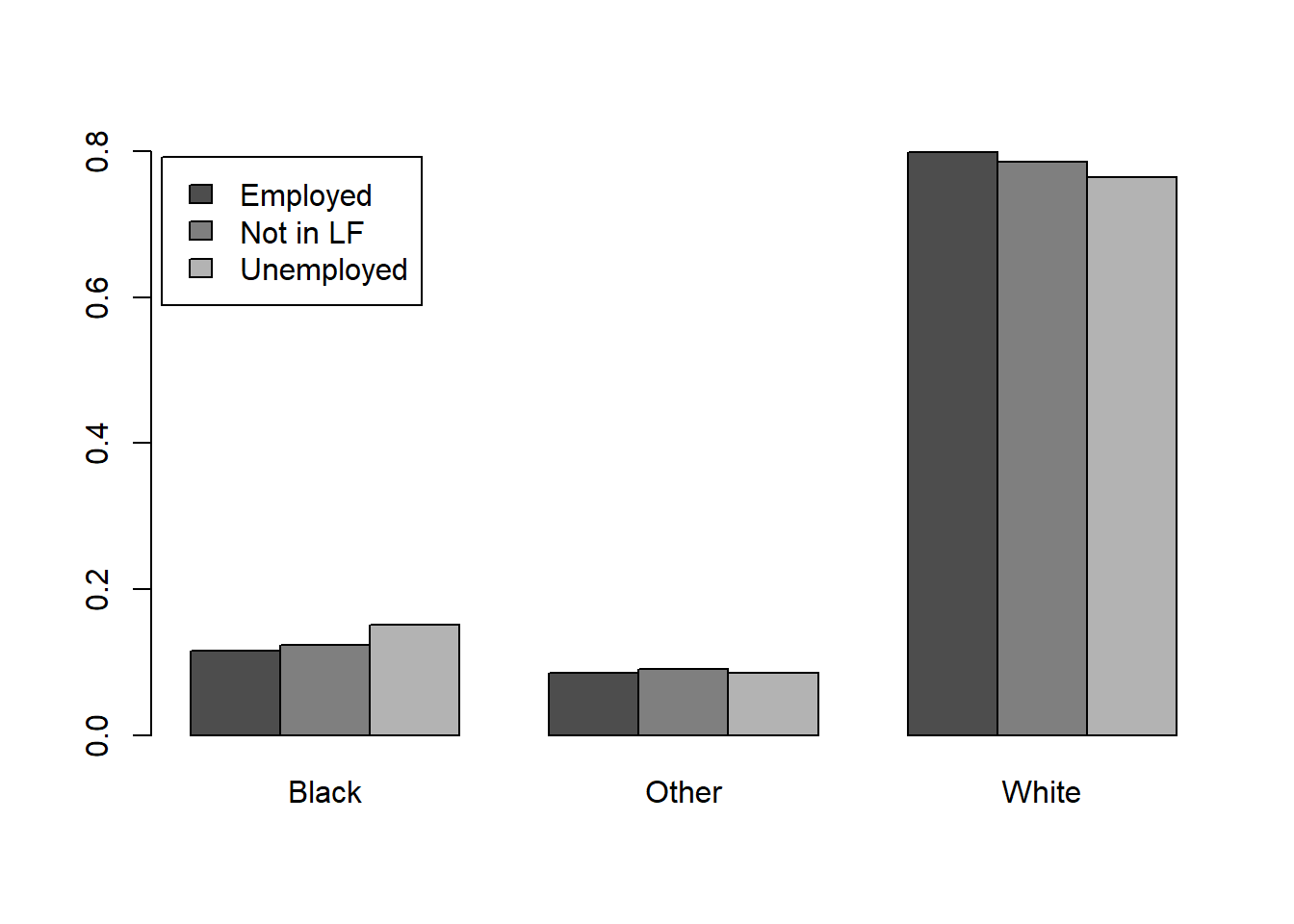
Showing distribution for different category: Example
Box plots of weekly earnings by race
boxplot(cps$earnwk~cps$race, ylab="Weekly earnings ($)", xlab="Race")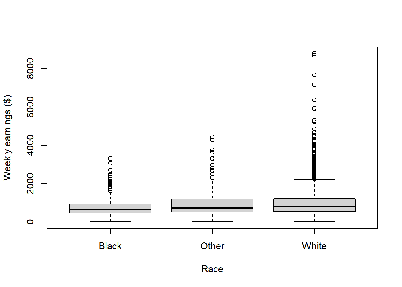
Density of weakly earnings by race
# createweeklyearningsvectorsforthethreesubsamples,byrace
earnwk_black <-cpsemployed[cpsemployed$race=="Black","earnwk"]
earnwk_other <-cpsemployed[cpsemployed$race=="Other","earnwk"]
earnwk_white <-cpsemployed[cpsemployed$race=="White","earnwk"]
# firstplotthedensityofweeklyearningsforblackindividuals
plot(density(earnwk_black), main="",xlab="Weekly earnings($)")
# overlaythedensityofweeklyearningsforother-raceindividuals
lines(density(earnwk_other), lty=3)
# overlaythedensityofweeklyearningsforwhiteindividuals
lines(density(earnwk_white), lty=2)
# drawthelegend
legend("topright", legend=c("Black","Other","White"), lty=c(1,3,2), inset=0.01)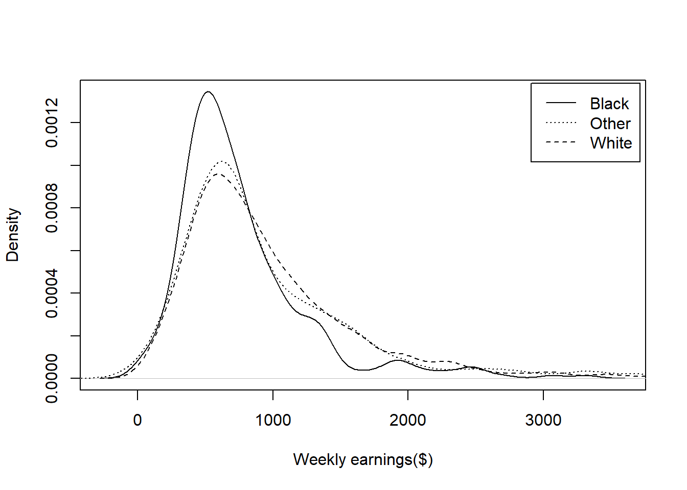
Scatterplot: Example
Weekly earnings versus years of education
# scatterplotofweeklyearningsversusyearsofeducation
plot(cps$educ, cps$earnwk,xlab="Education",ylab="Weekly earnings($)")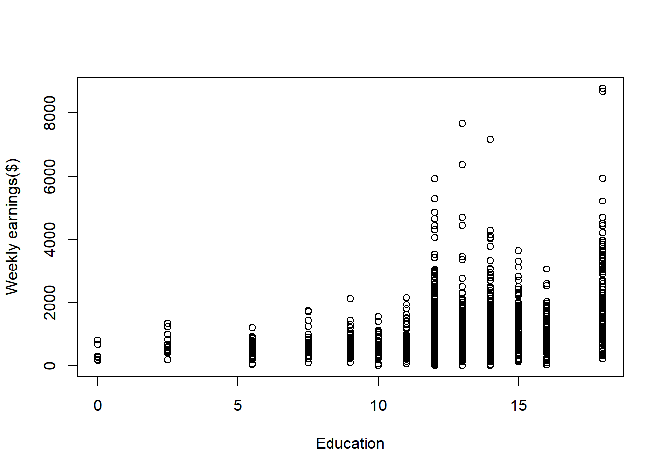
Expanded scatterplot: Example
Weekly earnings vs years of education vs weekly hours worked
# expandedscatterplot,withweeklyearnings,yearsofeducation,andweeklyhoursworked
plot(cps[,c("educ","earnwk","hrslastwk")])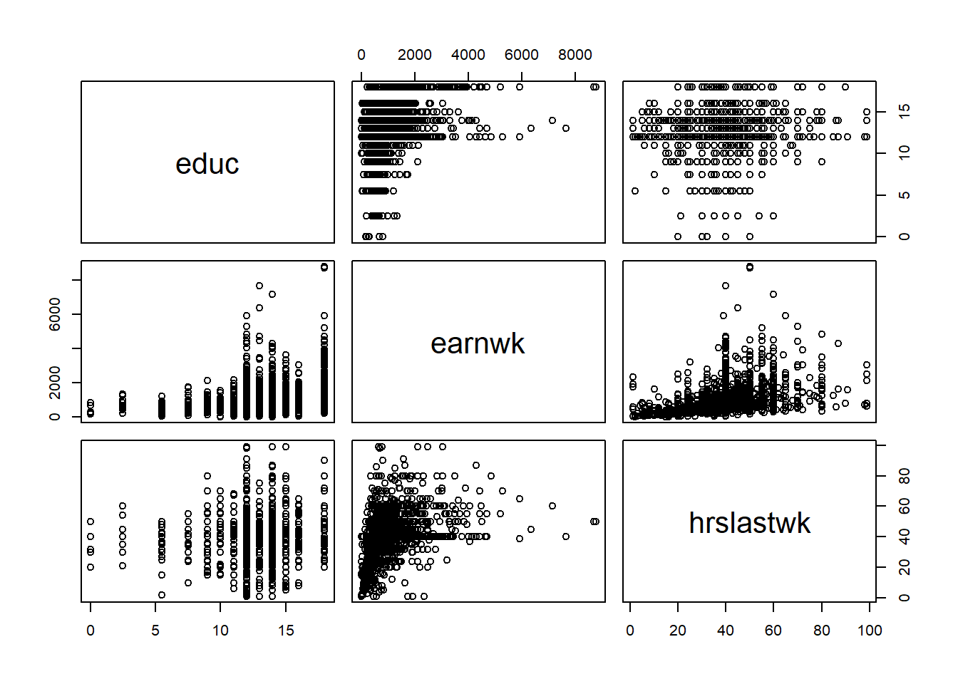
Exercise 4: Performing better data visualization
There is website that host a collection of beautiful charts you might want to visit: https://r-graph-gallery.com/. This exercise will require you to use the cps data we used above or other datasets from the textbooks package (see at https://probstats4econ.com/datasets.html), then produce the data visualization by replicating the code you find in the websites. Choose two graph that you really like and try to replicate it in the following code chunks. Remember to install the packages needed to produce the graph by putting the package name in the package manager chunk.
Visualization replication 1
Visualization replication 2
Wrapping up
Team Member 1: Render the document and confirm that the changes are visible in the PDF. Then, commit (with an informative commit message) both the .qmd and PDF documents, and finally push the changes to GitHub. Make sure to commit and push all changed files so that your Git pane is empty afterwards.
All other team members: Once Team Member 2 is done rendering, committing, and pushing, confirm that the changes are visible on GitHub in your team’s lab repo. Then, in RStudio, click the Pull button in the Git pane to get the updated document. You should see the final version of your .qmd file.
Submission
You will submit the PDF documents for labs in to Gradescope as part of your final submission.
Warning
Before you wrap up the assignment, make sure all documents are updated on your GitHub repo. We will be checking these to make sure you have been practicing how to commit and push changes.
Remember – you must turn in a PDF file to the Gradescope page before the submission deadline for full credit.
To submit your assignment:
Access Gradescope
Click on the assignment, and you’ll be prompted to submit it.
Mark the pages associated with each exercise. All of the pages of your lab should be associated with at least one question (i.e., should be “checked”).
Select the first page of your .PDF submission to be associated with the “Workflow & formatting” section.
Grading
| Component | Points |
|---|---|
| Exercise 1 | 5 |
| Exercise 2 | 5 |
| Exercise 3 | 80 |
| Exercise 4 | 5 |
| Workflow & formatting (Pushing to GitHub and Submit to Gradescope) | 5 |
The “Workflow & formatting” grade is to assess the reproducible workflow and collaboration. This includes having at least one meaningful commit from each team member and updating the team name and date in the YAML.